
When I first looked at CBX (now TradeBeyond), I saw a broken link between brands and their retail partners throughout the supply chain. Suppliers couldn't track their shipments, and retailers were constantly surprised by delays. I redesigned the platform to give everyone clear visibility from factory floor to store delivery, so teams could fix problems before they impacted customers expecting fast delivery.
I wore two hats on this project – UX designer by title, but I also jumped into product discussions whenever I could. I spent days with logistics teams to understand their headaches, then sketched solutions that actually made sense for their real-world challenges.
I wasn't just dropping designs over the wall – I sat with developers through implementation, tweaking as we learned what worked and what didn't.
Supply chains are messy, but our interfaces didn't need to be. The real trick wasn't simplifying the data – it was making it useful. I followed warehouse managers around for days, watching how they made decisions when shipments went sideways.
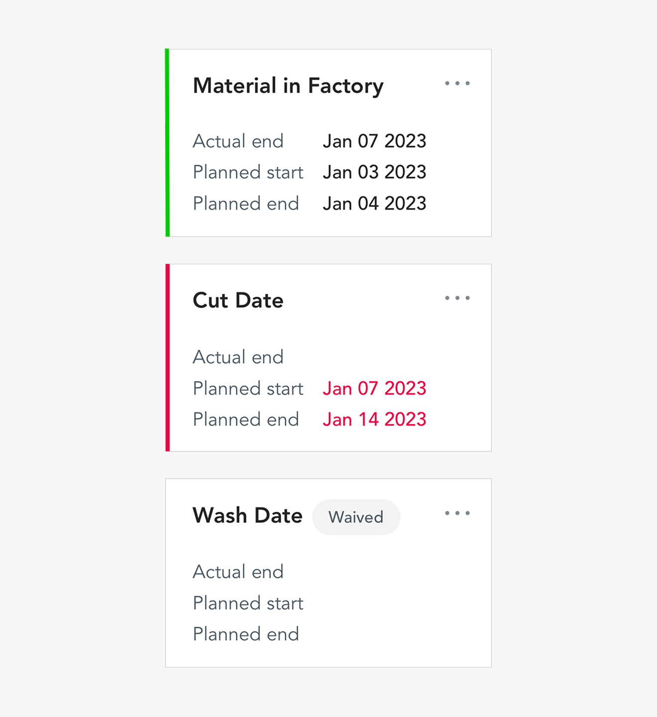
This led to dashboards that highlighted exactly what they needed to know, turning what used to be a day-long detective hunt into a 10-minute fix.
Samantha, our supply chain director, let me shadow her for a full day. I watched her juggle six browser tabs while on supplier calls, frantically searching for order numbers in emails during crisis moments. Her workarounds became our roadmap. We'd literally ask, 'Would Samantha be able to find this information in under 30 seconds?' when evaluating designs.
The persona image captures exactly how she cobbled together information from disconnected systems.

Samantha kept griping about never knowing where things stood with suppliers. So we tackled that head-on.
Instead of guessing how suppliers worked, we ran card sorting sessions with them directly. Turns out, we had our categories all wrong. They naturally grouped documents very differently than we expected – you can see this in the card sorting results. We completely reworked the navigation based on these insights, as shown in the portal architecture diagram. The registration flow got stripped down to the bare essentials – suppliers were onboarding in half the time.


We tested every iteration with real suppliers, from tiny local manufacturers to massive global operations. The designs had to work for both.
After launch, the numbers told the story – 60% of suppliers adopted it within the first year, orders moved 15% faster, and people were actually collaborating on the platform (up 20%).
But honestly, the best feedback was a supplier telling me they finally had a system that 'didn't fight them every step of the way.
Our old interface was a mess – colors everywhere, random fonts, duplicated features scattered across screens. Developers wasted hours trying to keep up with inconsistent patterns.
We stripped everything back to basics. The design system images show how we brought order to chaos with clear patterns and components. Look at the screens – from PLM software to dashboard to catalog showroom – they finally feel like parts of the same product. Developers could build features in half the time, and users didn't have to relearn the interface for every section.


Our data revealed that shipping document issues were responsible for a third of all delivery delays. Users struggled with our clunky forms, leading to wasted time and frequent mistakes.
To solve this, I led a team to completely rethink the experience. Instead of forcing users through an overwhelming form, we introduced a step-by-step flow. The before-and-after images tell the story—what was once a cluttered, confusing process became a clean, guided experience with a clear progress bar.


The impact was immediate. Document completion time dropped from 14 minutes to under 4, errors were reduced by 50%, and support calls about the process disappeared. The real highlight? When we demoed this feature at our client conference, it got actual applause—a first for our product team.
